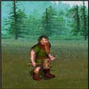
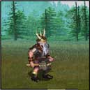
Dwarf evolution

The old Heroes games developed by New World Computing. Please specify which game you are referring to in your post.

Pick your favorite vertically challenged warrior

H1 Dwarf
3
5%
H2 Dwarf
4
6%
H2 Battle Dwarf
17
27%
H3 Battle Dwarf
14
22%
H4 Dwarf
6
10%
H5 Defender
11
17%
H5 Stout Defender
5
8%
H5 Brawler
1
2%
H5 Berserker
2
3%
 
Total votes: 63

User avatar
UndeadHalfOrc
Titan
Titan
Posts: 1363
Joined: 13 Mar 2007

Dwarf evolution

Unread postby UndeadHalfOrc » 13 Sep 2007, 12:42

For H5, since there's a whole dwarf town, I picked the two levels that were the closest to the original, low level, slow, short stout warrior.

For the record, I think "stout defender" sounds ridiculous, and so is his helmet! It looks like his wife dropped an anvil on his head from a balcony.

H1 Dwarf
Image

H2 Dwarf & Battle Dwarf
Image
Image

H3 Dwarf & Battle Dwarf
Image
Image

H4 Dwarf
ImageImage

H5 Defender
Image
H5 Stout Defender
Image
H5 Brawler
Image
H5 Berserker
Image

User avatar
ThunderTitan
Perpetual Poster
Perpetual Poster
Posts: 23271
Joined: 06 Jan 2006
Location: Now/here
Contact:

Re: Dwarf evolution

Unread postby ThunderTitan » 13 Sep 2007, 17:02

UndeadHalfOrc wrote: For the record, I think "stout defender" sounds ridiculous,
With all the other "great" names in H5 you barely notice it...


I'm not sure between teh H2, 3,4 and the normal H5 defender versions... they all have something i like (the Stout guy is too overdone also)
Disclaimer: May contain sarcasm!
I have never faked a sarcasm in my entire life. - ???
"With ABC deleting dynamite gags from cartoons, do you find that your children are using explosives less frequently?" — Mark LoPresti

Alt-0128: €

Image

User avatar
Humakt
Swordsman
Swordsman
Posts: 582
Joined: 06 Jan 2006

Unread postby Humakt » 13 Sep 2007, 17:10

Where you got "Stout Defender" from? The name it shows in game is Shieldguard.

Voten H2 Battle Dwarf partly for his "Ups, I died" animation.
Thundermaps
"Death must be impartial. I must sever my ties, lest I shield my kin."

User avatar
ThunderTitan
Perpetual Poster
Perpetual Poster
Posts: 23271
Joined: 06 Jan 2006
Location: Now/here
Contact:

Unread postby ThunderTitan » 13 Sep 2007, 17:13

It was called that once for sure.
Disclaimer: May contain sarcasm!
I have never faked a sarcasm in my entire life. - ???
"With ABC deleting dynamite gags from cartoons, do you find that your children are using explosives less frequently?" — Mark LoPresti

Alt-0128: €

Image

User avatar
Darmani
Blood Fury
Blood Fury
Posts: 479
Joined: 06 Jan 2006
Location: Cambridge, MA

Unread postby Darmani » 13 Sep 2007, 22:23

Wow....the Defender looks like the Fat Lady whose song has the power to end things.

I voted H4, with H2 Battle Dwarf being a slightly-distant runner up. The H1 Dwarf looks like a cute Saturday-morning cartoon character. The H3 dwarves look like a live-action cute midget. The H5 ones all look ridiculous. The H2 ones look a lot more like dwarves - short, but strong, stout, stubborn, and serious. I think the H4 ones really play the role though, especially with that nice, heavy armor.

User avatar
UndeadHalfOrc
Titan
Titan
Posts: 1363
Joined: 13 Mar 2007

Unread postby UndeadHalfOrc » 13 Sep 2007, 22:29

Although I hate almost all H4 graphics, I almost voted for H4 this time. I really like H4's dwarf.

User avatar
Bandobras Took
Genie
Genie
Posts: 1019
Joined: 06 Jan 2006

Unread postby Bandobras Took » 13 Sep 2007, 22:33

The Dwarf just hasn't been the same since H2. The clear winner for me.
Far too many people speak their minds without first verifying the quality of their source material.

User avatar
HodgePodge
Round Table Knight
Round Table Knight
Posts: 3530
Joined: 06 Jan 2006

Unread postby HodgePodge » 13 Sep 2007, 23:02

Bandobras Took wrote:The Dwarf just hasn't been the same since H2. The clear winner for me.
Voted: H2 Battle Dwarf

I agree. Those ridiculous H5 Dwarves are just too 'overdone' with their kilts that all have the same Tartan plaid pattern, just different colors. They're just okay, just not a winner. But then, that's the whole story of Heroes V.
Walk Softly & Respect All Life!

Click Here: Lords of War and Money … A Free & Fun Browser Game.

User avatar
Elvin
Round Table Hero
Round Table Hero
Posts: 5475
Joined: 27 Aug 2006

Unread postby Elvin » 13 Sep 2007, 23:30

H2 battle dwarf with the H3 one closely behind. I didn't like much the H4 one and while I like the H5(at least a few) they are not exactly what I have in mind as dwarves.
I, for one, am dying to find out what colour they paint Michael's toenails.
- Metathron

User avatar
asandir
Round Table Hero
Round Table Hero
Posts: 15481
Joined: 06 Jan 2006
Location: The campfire .... mostly

Unread postby asandir » 14 Sep 2007, 01:02

this one shouldn't even be a challenge, those that pick other than the H2 Battle Dwarf, or the vanilla version for those that like smaller horns and red over blue .... are obviously visually challenged

H1 has a comical appeal, but it's harly gonna win a contest, HIII is so-so, but hardly inspiring, HIV is sad, and I'm not sure that I can say anything nice about the HV versions ....

but that's just me
Human madness is the howl of a child with a shattered heart.

User avatar
PhoenixReborn
Round Table Hero
Round Table Hero
Posts: 2014
Joined: 24 May 2006
Location: US

Unread postby PhoenixReborn » 14 Sep 2007, 02:04

The inevitable conclusion of all these polls is that heroes 2 has the best graphical style.

Can somebody do one of these for the adventure map screens?

User avatar
HodgePodge
Round Table Knight
Round Table Knight
Posts: 3530
Joined: 06 Jan 2006

Unread postby HodgePodge » 14 Sep 2007, 02:59

PhoenixReborn wrote:The inevitable conclusion of all these polls is that heroes 2 has the best graphical style.

Can somebody do one of these for the adventure map screens?
Yes, it's hard to improve on the best. :-D
Walk Softly & Respect All Life!

Click Here: Lords of War and Money … A Free & Fun Browser Game.

User avatar
asandir
Round Table Hero
Round Table Hero
Posts: 15481
Joined: 06 Jan 2006
Location: The campfire .... mostly

Unread postby asandir » 14 Sep 2007, 03:45

HodgePodge wrote:
PhoenixReborn wrote:The inevitable conclusion of all these polls is that heroes 2 has the best graphical style.

Can somebody do one of these for the adventure map screens?
Yes, it's hard to improve on the best. :-D
the best art style, colours, and the best "fun" factor of any of the series :D
Human madness is the howl of a child with a shattered heart.

User avatar
Metathron
Round Table Hero
Round Table Hero
Posts: 2704
Joined: 29 Jan 2006
Location: Somewhere deep in the Caribbean...
Contact:

Unread postby Metathron » 14 Sep 2007, 08:53

Voted for the H2 dwarf, though I might as well have gone with the upgraded one or the H4 one, as they are all pretty great. Like I'm sure I've said before, H3's graphics were too washed out for my taste, and I think the naga is the only H3 creature that's ever got my vote in these polls.
Jesus saves, Allah forgives, Cthulhu thinks you'd make a nice sandwich.

User avatar
TheUndeadKing
Swordsman
Swordsman
Posts: 588
Joined: 04 Dec 2006
Contact:

Unread postby TheUndeadKing » 14 Sep 2007, 11:12

Voted for the H4 Dwarf. They fit perfectly with the snowy terrain, as well.
"I saw the angel in the marble and carved until I set him free..." - Michelangelo

User avatar
Ohma
Leprechaun
Leprechaun
Posts: 40
Joined: 07 Sep 2007
Location: Eugene, OR (the Vancouver of California's Canada)

Unread postby Ohma » 14 Sep 2007, 16:12

I'm going to break with popular opinion and vote for the H1 Dwarf. 2 had great art direction and style, but I feel the Dwarves were too busy (graphically) for what they could display properly. Also since my personal vision of the HoMM-verse is a sort of nebulous, constantly changing, storybook fantasy world, the Dwarves in 1 fit better to me.
The ones in 5 look fine, but they suffer from the whole "we look just like our counterparts in other popular fantasy game settings LOL" thing that 5 unfortunately has, 3 and 4 are just too bland for me.
Free IO!!
Cheng I Sao r0xx0rz my 50xx0rz!!
Glory to the Many!
"Beware of he who would deny you access to information, for in his heart he dreams himself your master." -Pravin Lal
We're *ALL* Devo!

User avatar
asandir
Round Table Hero
Round Table Hero
Posts: 15481
Joined: 06 Jan 2006
Location: The campfire .... mostly

Unread postby asandir » 15 Sep 2007, 00:10

but they're so funny looking :D
Human madness is the howl of a child with a shattered heart.

User avatar
PhoenixReborn
Round Table Hero
Round Table Hero
Posts: 2014
Joined: 24 May 2006
Location: US

Unread postby PhoenixReborn » 15 Sep 2007, 04:46

Ohma wrote: but I feel the Dwarves were too busy (graphically) for what they could display properly.
I don't quite understand what that sentence means. Could you explain it in more detail?

User avatar
Ohma
Leprechaun
Leprechaun
Posts: 40
Joined: 07 Sep 2007
Location: Eugene, OR (the Vancouver of California's Canada)

Unread postby Ohma » 15 Sep 2007, 14:36

PhoenixReborn wrote: I don't quite understand what that sentence means. Could you explain it in more detail?
That HoMM 2 didn't have a high enough resolution for something the size of the Dwarves to have chain mail, an intricately engraved axe, or detailed facial hair, without the whole thing looking messy.
Free IO!!
Cheng I Sao r0xx0rz my 50xx0rz!!
Glory to the Many!
"Beware of he who would deny you access to information, for in his heart he dreams himself your master." -Pravin Lal
We're *ALL* Devo!

User avatar
wimfrits
Round Table Knight
Round Table Knight
Posts: 2050
Joined: 06 Jan 2006
Location: Utrecht, the Netherlands

Unread postby wimfrits » 16 Sep 2007, 05:53

Voted: H5 defender

People seem to forget that aside from 'ready to do battle', a dwarf should also look like it could 'enter a bar without looking odd'.

That only leaves the H3 dwarf and H5 defender (and possibly the H5 brawler). The rest have too much neatly organized armor on them.
Are you suggesting coconuts migrate?


Return to “Heroes I-IV”

Who is online

Users browsing this forum: Bing [Bot] and 0 guests