 In case you are stuck at work or home alone on a Friday night, we have a little diversion for you. The second part of Heroes V, Deconstructed is now online. Picking up where the discussion about graphics ended, Corribus tells us why he felt graphics impede gameplay. He also talks about music, sound effects and those infamous cut scenes. Please join the discussions.
The next part of the series will be up on Monday.
-
Functionally, the graphics impede gameplay.
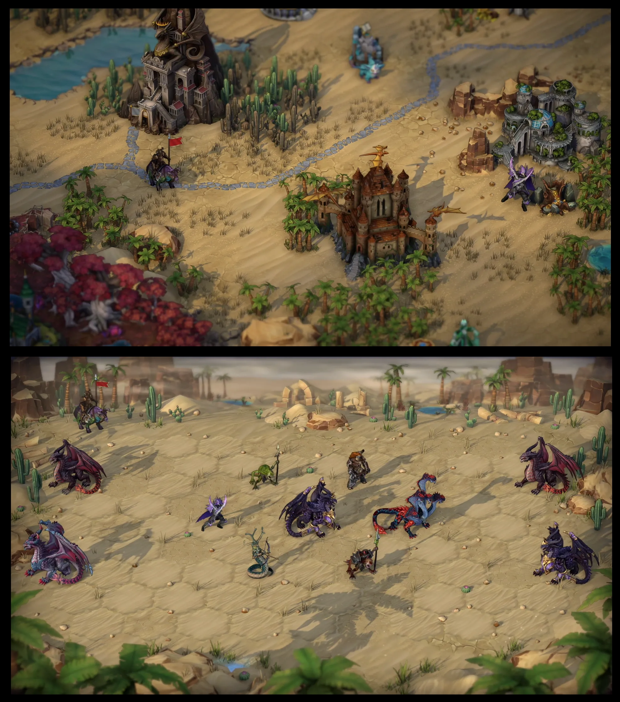
Well, once the initial wow-factor wore off, my feelings about the graphics, at least from a functional perspective, began to cool. I find the constant zooming in and out, and constant need to attend to camera angles, very distracting. If I zoom out, it’s hard to place my horse cursor with precision, and it’s also hard for me to identify objects, particularly artifacts. If I zoom in, it’s hard to take in my surroundings from enough of a global perspective to make sound strategic decisions. It’s also easy to become disoriented when I rotate the camera angle after switching to another hero, as it takes several seconds for my brain to re-determine where everything on the map is in relation to everything else. That is, if east was right before, now it’s left, because I’ve rotated by 180 degrees to accommodate the next hero. Having to engage in this sort of mental gymnastics with the map every couple of minutes is vexing.
I mentioned earlier that all these great visuals take away that game-board feeling. That has a good aspect, in that I feel more immersed in the game, but it also really clouds what is inherently supposed to be a strategy game. I guess I’d rather have a plain-looking but deep strategy game than a great looking but shallow one. It’s just as easy to destroy a strategy game by overloading it with fancy visuals as it is by not putting enough effort into the presentation. It’s definitely a fine line. I recognize that most of us “older gamers” would be just as happy buying a game with no fancy visuals if it delivered lots of good gameplay (Battle for Wesnoth is a good example), but as I said, graphics sell, so I accept that in a modern game, that’s what I’m going to get. Nevertheless, I can’t help but feel that, while H5 may turn out to be a perfect engine in which to make good RPG or story map, due to the immersiveness of the interface, at this initial moment I worry that a good strategic experience is going to be hard to find. Even if there is incredible depth beneath all these fancy graphics, it may just be hard to get to because of all the animations and constant micromanaging of the interface you are forced to do in order to play the game. Having now played H5 for a little longer, I have gotten somewhat used to all the zooming and camera rotating, but I still have not changed my mind in this respect. This seems less a strategy game with RPG elements than it is an RPG game with strategic elements. That’s not necessarily a bad thing – especially since I usually turned my H3 maps into RPG style maps anyway – and for me it may ultimately satisfy, but I can see how players with interest only in the strategy aspects of HoMM may be turned off by HoMMV.
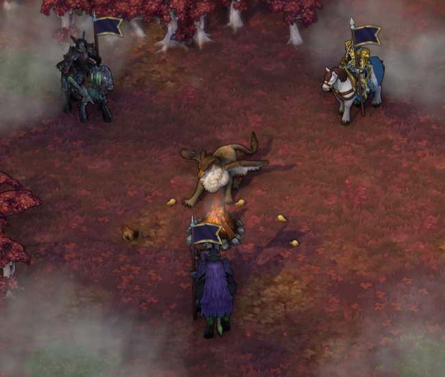
I note that the graphics impede the tactical aspect of battles to a less degree (more on battles below), because there is less zooming and rotating necessary. I did a lot of that in the beginning to see animations and take in a lot of the visual effects, but I am now finding I am zooming and rotating a lot less and concentrating on what is actually going on in the battle. I do sadly lose a lot of that nice animation detail by being zoomed out – and all of those stupid underground elves look the same to me when zoomed out – but in order to really make tactical decisions, zooming out is the only way to play. Otherwise, I can’t see the whole battlefield. Actually, sometimes when I make a killing stroke, I zoom in really quickly with my mouse wheel to try to see the death animation in all its glory, but it’s clumsy and doesn’t always work. It would have been nice if they had programmed the game so that it automatically zoomed in close so you could watch the death animation (and then zoomed back out to your previous setting). In any case, so while they don’t really need to interfere with tactical decisions, a lot of the battle-related eye candy, while beautiful to behold, seems sort of wasted. The exception to this that I have found is castle sieges. The “3D look” to the castle walls really gets in the way and the camera is a female-dog to rotate properly. I have a hard time seeing what’s going on, and there seems to be no ideal perspective. Meh, overall I conclude the graphics to be a wash. The game does look outstanding, and there is a lot of detail to appreciate, but all the fancy graphics have drawbacks. I guess in the end I prefer a more gameboard-like look, but that might just be the old-school in me.
-
Sound effects and music are nice but repetitive
For good or for ill, the visuals are easily the first thing I noticed about the game. As a result, it took me a while before I even thought to pay attention to the sound. In the menu screen once the game loads up, I at first thought there was no sound at all, until I realized that the beginning of the background music was very subdued. After listening to it for a little bit, I decided that I liked the melody, but it’s a little too understated for a main menu screen. Being scored by Rob King, composer of the music for several previous HoMM titles, the style is familiar to me, and I’m glad that some vocals have returned to accompany the orchestra. But aside from the intro tune, which is really great, I will be honest and say that overall, I find the music in H5 to be a little ho-hum. Nothing terrible and annoying, but nothing that fabulous either. In most cases, I would say that that is fine. For most games, particularly strategy games, the music just needs to be something innocuous that doesn’t loop so frequently that it becomes to repetitive, and contains no jarring sounds that distract me from the game. Really, the music is supposed to just be there so I am not playing in silence. It really serves no other function.
But in this case, I’m quite aware of how much ambiance that music can provide to a HoMM game. The music in H2 is among some of the best music I’ve ever heard in a computer game, so good in fact that, if the pieces were just a bit longer, I would almost listen to them on a regular basis. There was just an extra bit of wow-factor in that sound-track that made it especially memorable, and it really perfectly set the mood of each terrain and/or castle type in the game. With its sweeping operatic voice-overs, the music also gave H2 a serious, over-the-top dramatic tone that conflicted, in a good way, with the almost cartoonish visuals. The music of H3 was, for me, a low point in the series. Of all the things H3 did right, the music was not one of them. I can specifically remember several pieces of music from H2. I remember none from H3, except that I thought most of the tunes were all dull. In H4, I recall that I did enjoy some of the music, because of the return of some of the opera, but, perhaps because I was soured on the game as a whole, I found it too repetitive. Still, knowing what Rob King could accomplish, I was eager to see what kind of musical score H5 would offer. I’m sorry to say that having listened to a larger portion of the sound-track, I remain a little underwhelmed. I can’t think of a tune yet that has made me want to pause my progress in the game just to listen to it – as I did with almost every town theme in H2. It just sort of fades into the background and I hardly even notice it. I have not yet really been on many terrains except for grass, lava and underground, so maybe that will change, although I’m not sure if the music is related to terrain yet, which is unfortunate if it isn’t. Don’t get me wrong. The music isn’t bad. It’s nice. But it isn’t H2’s music, either. Whether due to the music itself or due to how it’s implemented in the game, it just seems a little repetitive to me.
This also goes for the sound effects, by the way. As with music, H2 had many great sound effects, such as the infamous vampire “bluh”. I was really hoping “bluh” would return. But it didn’t. Sigh.
-
Some of The Cut-Scenes are Really Corny
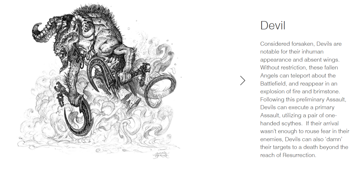
Ok, the other thing I noticed almost right away, are the cut-scenes. The intro scene was pretty interesting, I guess. Guy and gal getting married, and a big devil bursts through the window. The fight between the devil and knight is interesting in that you see the devil use its teleportation skill in the cut-scene. That was pretty cool. Sadly, the in-game cut-scenes are worse. Much worse.
Now, cinematics and campaign cut-scenes have never been much of a strong-point for previous HoMM games. They were basically just involved enough to introduce you to your goal for any given map, but in most cases story events were conveyed by text passages in the maps themselves. In H5, I noticed that there are actually very few text events in the maps themselves. In places where story events need to be described, we quickly go to short, cinematic cut-scenes that usually involve several of the important characters sitting on their horses having conversations.
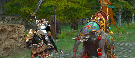
This in itself wouldn’t be so bad if the voice acting wasn’t so mediocre. Isabel’s and Godric’s voices aren’t too bad – although Isabel is a little needlessly thick on the accent – but Agrael’s is just very badly miscast. In fact everything about Agrael’s presentation is just ridiculous – he is supposed to be some big scary demon knight but he just comes off looking like something straight out of the power rangers. Maybe it’s the cartoonish tomato-red armor? But back to his voice – being some big scary demon, I expected him to have a deep, bass-filled voice to match, but what issues forth is anything but. Biara’s voice is a little better, but just doesn’t sound wicked enough for me. That’s about all of the voices I’ve heard – with the exception of a short scene with Nicolai – but in the future, Ubisoft needs to put some more thought into matching voices with characters. It *does* make a difference. (Edit: I’ve progressed a little farther into the Inferno campaign since having written this and learned a little more about Agrael’s character, and my feelings have tempered a little bit; the quality of the cut-scenes has also improved. But the bright red armor still looks stupid.)
The Haven cut-scenes, I find, are further marred by what seems to be corny posturing by the characters at nonsensical instances during the conversations. Each character it seems has two animations: swaying back and forth as if trying unsuccessfully to stand (or sit) completely still, and then some additional animation such as casting a spell, raising a sword, or what have you. Lips don’t move with speech, which is distracting enough, but then the conversation is punctuated periodically by things such as Godric yelling “GRIFFIN FOREVER!”, followed by him raising his sword, casting the spell Big Stupid Ball of Blue Light, and then gesturing outwards in battle fury. Then it’s back to the conversation. It’s clearly the same animation Godric uses on the battlefield when he casts a spell, but in the middle of a conversation, it just comes off looking ridiculous. Every now and then, during a conversation, Catherine will raise her sword and shout something silly like, “HAIL KING NICOLAI!”, and rear her horse. Biara will gesture to the camera with a series of curling hands, in much the same manner that you might expect Rocky Balboa to goad a KO’d opponent in the middle of a boxing bout. These over-the-top, mistimed gestures and spell effects are jarring given the fact that they are taking place during what appears by voice-tones to be a casual conversation, and just make those conversations seem contrived and silly, like something you’d find in a child’s cartoon.
So far, I’d have to say the cut-scenes are a low-point in the game. They are improving, and up until now the Inferno cut-scenes have been much better than those of the Haven campaign, so maybe there’s still hope. Am I alone in this thinking?

