Arcante - A Might and Magic inspired game
------------------------------------------------
The game is now available on Steam !
------------------------------------------------
Hello everyone,
I've seen amazing projects displayed on this forum over the years, and finally I would like to introduce you to mine!
It's a new game I developed, called Arcante.
First of all, I'm obsessed with Might and Magic 6 to 8, I played them since I was a little kid and I ended up completing them at least once a year (I'm quite nostalgic, but I bet you guys are too).
My plan was not to copy the M&M games (also because by myself, I would never be able to make one as good), but to make a new one. So Arcante is the result of me trying to reproduce the feeling of old M&M games, thus you won't find any element of it that is equal, but many aspects of it that are familiar.
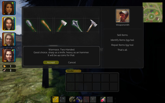
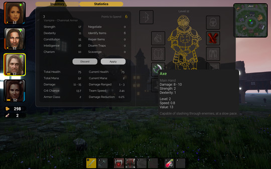
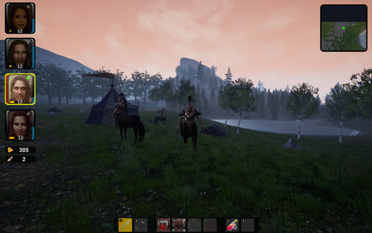
I think that screenshots are better than me explaining things, so:
The path is unclear, you will likely die a lot, the combat system is meant to be very dynamic, you will go from house to house in search of tips and you'll end up trying to interact with every rock
It's not turn based, as I never played the old M&M like that, I used to run around a lot, trying to dodge everything.
I'd be really glad to know what do you guys think, especially if you have suggestions (currently it's listed as coming-soon on steam, I still have some time before it goes live).
Also, it's my first game, I had no experience before this one, and what I'm most worried about is that beta-testers seems scared, giving it up quickly because they cannot understand how to play it (you need to read carefully and explore a lot). So I think that your feedback will be vital!
Thank you all for keeping this forum alive.
Last edited by Lorcan on 27 Oct 2020, 09:37, edited 2 times in total.
Re: Arcante - A Might and Magic inspired game
[Discuss in forum to see openning post from Lorcan]
Hello and welcome!
Can you link here any demo or we need all to wait 12 days more?
Although they say, that picture is worth of thousands words. Trying gameplay is still uncomparable. :p
This depends, on clues provides, even to beta testers.
I see just one of the clues, in your pics. For all MM(like) games is typical, that you discover the rules as you go. Some are easy to discover and some mechanic is up to you to guess.
[Back to CH]
Last edited by Pol on 17 Oct 2020, 11:51, edited 3 times in total.
"We made it!"
The Archives | Collection of H3&WoG files | Older albeit still useful | CH Downloads
PC Specs: A10-7850K, FM2A88X+K, 16GB-1600, SSD-MLC-G3, 1TB-HDD-G3, MAYA44, SP10 500W Be Quiet
The Archives | Collection of H3&WoG files | Older albeit still useful | CH Downloads
PC Specs: A10-7850K, FM2A88X+K, 16GB-1600, SSD-MLC-G3, 1TB-HDD-G3, MAYA44, SP10 500W Be Quiet
Re: Arcante - A Might and Magic inspired game
Now that you say it, it does sound bad to let you wait with just a few screenshots
I do have a trailer/gameplay, so I can at least show you that!
https://steamcdn-a.akamaihd.net/steam/a ... 1602573664
With the linked credits:
https://pastebin.pl/view/a30e00f8
As for the demo, I don't really have one But I could let a few of you access the Beta, in case you are interested!
I do have a trailer/gameplay, so I can at least show you that!
https://steamcdn-a.akamaihd.net/steam/a ... 1602573664
With the linked credits:
https://pastebin.pl/view/a30e00f8
As for the demo, I don't really have one But I could let a few of you access the Beta, in case you are interested!
Re: Arcante - A Might and Magic inspired game
Interesting project, try not to abandon it, I want to see an indie/fan mm- or wizardry- like project completed at last.
Re: Arcante - A Might and Magic inspired game
Yup! Interesting stuff, hopefully going to the see light of the day!
"There’s nothing to fear but fear itself and maybe some mild to moderate jellification of bones." Cave Johnson, Portal 2.
Re: Arcante - A Might and Magic inspired game
Hopefully, because seeing the light of the delay, wouldn't cut it
I will make a news and put it on Discord this night, at least a little help. Ofc getting some beta testers would be the best.
"We made it!"
The Archives | Collection of H3&WoG files | Older albeit still useful | CH Downloads
PC Specs: A10-7850K, FM2A88X+K, 16GB-1600, SSD-MLC-G3, 1TB-HDD-G3, MAYA44, SP10 500W Be Quiet
The Archives | Collection of H3&WoG files | Older albeit still useful | CH Downloads
PC Specs: A10-7850K, FM2A88X+K, 16GB-1600, SSD-MLC-G3, 1TB-HDD-G3, MAYA44, SP10 500W Be Quiet
Re: Arcante - A Might and Magic inspired game
You need to take some other games as reference when playing their tutorials. I think it's quite clear, but it might become a bit fuzzy if you have too many other things in your head. I am not an expert, but as a gamer, tutorial is very important to show basic to intermediate commands, leaving the advanced stuff for the player to try it out by applying all the notion one learned with basics and intermediate.Lorcan wrote:I'm most worried about is that beta-testers seems scared, giving it up quickly because they cannot understand how to play it (you need to read carefully and explore a lot).
For example, in Ori and the Blind Forest, you obviously will move your character with arrow keys, but you have generally 2 of those, for gaming keyboards have ASWD keys usually tied for that function too. Considering your public is likely to be these which uses ASWD, when they get control over their character, display ASWD hint for movement, and 'use your mouse to look around'. In Ori, one the first commands is showing how to jump, then to jump higher. Hint would prompt when reaching a point where to use it. Same for some abilities you found. A very brief description of its effect and how to use it. And it would usually prompt you or require you to use that ability right away to move from the place, and make players use each of these abilities every now and them to keep going on the main arc or so side-quests or free exploration. I remember dying a lot in a place in first Ori game because there was a command I simply forgot I had, because I had not used it for a while and it was not really required a lot either.
But in a game like yours, it requires more tinkering with words and proper writing, describing things so players don't feel like solving riddles only to execute basic commands. In Mass Effect, you were taught how to move, look around, to get into cover (big signaling arrows explained where to go and what to do), how to keybind abilities, your companions' abilities, how to move them to specific points. You had that in game tutorial, but you also had Menu tutorial, which was a more detailed explanation of the game mechanics. You can also add some manner of codex, for whatever new thing player encounters in their path, some information is added to the codex. For Lore fans, that's nice and sometimes help giving directions on how the world building actually works.
Commands must have some manner of customization, easy key bindings. That's really mandatory, imho.
If you have weapons with different effectiveness and traits, it must be explained somewhere, like a local armsmaster, also considering said master's background, if too experienced or not that much. Depending on how you build that character, he'll relay general info, or detailed info, or just something that prompts your reasoning. Example: "Hello there! I am trying to get these weapons ready for an important delivery. Only Lances! I am not a fan of them, but their reach is awesome! Quite nice when you find those awful gargoyles!" And with this information, you'll likely conclude it's a good weapon to be used against flying fiends at close range. If weapons that slash are mechanically different from those that crunch or piercer, that must be clear, just like light to heavy armor, or different magical contraptions.
You need to be creative and concise at explaining things in-game, and have a more detailed tutorial through menu access (or something your characters can find easily, like in a save point or a floating orb, whichever works best), so you cover a larger group of players' preferences and limitations, instead of hoping they'll understand only one way or another, if you don't give them the choice. Remember, choice, customization, this is very important design.
Writing is also extremely important for questing. It is not good forcing players to have to talk with every single npc in the game. It takes away their choice to go on faster and try to work out things from their deduction by smaller bits of information, and, whenever possible, not to make scripted quests only to unlock through talking, except for very specific situations, but nothing like finding an odd tree with a hidden entrance in its roots, but you cannot enter it because you have not spoken with a random guy at the last and almost invisible hut somewhere. And if you think on replayability, where people already know what to do, that's one thing to keep in mind. The thing is having choices as how to play, and not a single cemented formula.
I need to get back to work now. We can talk more later.
"There’s nothing to fear but fear itself and maybe some mild to moderate jellification of bones." Cave Johnson, Portal 2.
Re: Arcante - A Might and Magic inspired game
Thanks guys!
I'll definitely not abandon it, after spending months working on it night and day hah
About your comment Panda Tar:
First of all, my current goal is to make the game accessible and enjoyable to a wider range of people, so your feedback is much appreciated.
Now, the tutorial, mine definitely has to improve, I'm spreading more and more hints about the mechanics, accessible in different ways (NPC, completing quests, walking around..). It's not easy, so probably 80% of the time I have left until the launch will go there, but I think it's vital.
It's not necessary to talk to every NPC, but doing that might save you some time and lets you discover something new, for example, if you skip all the dialogues and don't explore, you might miss out the fact that there's an healer in the city. If I tell the players directly that there's an healer then what's the point of having NPCs giving you that hint?
Customization is a complex topic, I totally agree it's a good thing, but the lack of customization is the only thing that made me reach the goal of having a playable game from beginning to end in a reasonable amount of time (not really reasonable, it's a huge amount of time haha). I did try to offer as much choice as possible though, a lot of weapons, armors, portraits, having more classes than you can pick and so on.
As for the commands, I haven't added the possibility to customize key-bindings, I actually don't want players to modify key bindings, as I know what's the intended use of them but they might not know it. The ability system is very particular (even odd), kind of similar to LOL, where almost everyone has abilities mapped on QWER and has to get used to it. This gives me the opportunity to show on the action bar the key that corresponds to each ability/slot.
It's hard to reply to such a detailed comment, but to sum it up: I'm noting all your suggestions, and I will try to implement them the best I can
I also have to say that my beta testers were all casual gamers, so it's likely they just weren't committed enough.
Last edited by Lorcan on 16 Oct 2020, 18:00, edited 1 time in total.
Re: Arcante - A Might and Magic inspired game
I'll get back to you here when I get more time, but I wanted to talk about this specifically:
**********
Back then.
I could test it too. Perhaps I can give another hand the best way I can. And I am happy to be of service.
There are people with certain disabilities that might want to play, gamers. Customizing key-bindings is a very important thing, if you want to encompass them as well, or they might not be able to play comfortably or even play it at all, you see. And there are demanding people, who are picky with stuff like that, but sometimes, these people who gets fed up with details, are very good at giving constructive feedbacks. I think you should reconsider this feature.As for the commands, I haven't added the possibility to customize key-bindings, I actually don't want players to modify key bindings, as I know what's the intended use of them but they might not know it.
**********
Back then.
It depends on what level of customization we are talking about now. Witcher you had only 1 character. Most 'customization' came from items, skills and story choices; and of course, the freedom to explore and choose what to do next. So, can you elaborate what you actually cannot customize?Customization is a complex topic, I totally agree it's a good thing, but the lack of customization is the only thing that made me reach the goal of having a playable game from beginning to end in a reasonable amount of time (not really reasonable, it's a huge amount of time haha). I did try to offer as much choice as possible though, a lot of weapons, armors, portraits, having more classes than you can pick and so on.
It all depends on how people prioritize their experience. Some stuff might be blatantly evident to me, and really not of a fuss to someone else. But bear in mind that, they helped one way or another. Just not as thoroughly as someone else with more time or more demanding on details, who knows!I also have to say that my beta testers were all casual gamers, so it's likely they just weren't committed enough.
I could test it too. Perhaps I can give another hand the best way I can. And I am happy to be of service.
Last edited by Panda Tar on 16 Oct 2020, 22:43, edited 2 times in total.
"There’s nothing to fear but fear itself and maybe some mild to moderate jellification of bones." Cave Johnson, Portal 2.
Re: Arcante - A Might and Magic inspired game
News is up and connected here!
Re: Arcante - A Might and Magic inspired game
You have a point. I've been thinking about adapting the game to make a joystick (console?) version. I'm guessing that in general joysticks are more accessible? The game in that version would be a bit more "action". It will definitely take time to do it so my plan was to wait and see if anyone was actually requesting that.Panda Tar wrote:There are people with certain disabilities that might want to play, gamers. Customizing key-bindings is a very important thing, if you want to encompass them as well, or they might not be able to play comfortably or even play it at all, you see. And there are demanding people, who are picky with stuff like that, but sometimes, these people who gets fed up with details, are very good at giving constructive feedbacks. I think you should reconsider this feature.
I was mostly referring to the story, which is mostly a straight line, my goal there was to make it interesting, more than interactive. And things like options are a real pain, they take so much time.Panda Tar wrote:It depends on what level of customization we are talking about now. Witcher you had only 1 character. Most 'customization' came from items, skills and story choices; and of course, the freedom to explore and choose what to do next. So, can you elaborate what you actually cannot customize?
Yep, definitely useful, they are the reason for which I'm panicking now about people understanding the game What I meant was actually more like "they might not enjoy this kind of game and not my game specifically".Panda Tar wrote:It all depends on how people prioritize their experience. Some stuff might be blatantly evident to me, and really not of a fuss to someone else. But bear in mind that, they helped one way or another. Just not as thoroughly as someone else with more time or more demanding on details, who knows!
Thanks a lot Pol!Pol wrote:News is up and connected here!
Re: Arcante - A Might and Magic inspired game
Ok, got it. Going to test soon ... pretty soon ...
***********
So, question: Do I report here whatever I find? A small detail about myself: I am a graphic designer, so I might point out some details regarding that. I am also very attent to how things are written.
I am at the main menu now, selecting the first character. Little things I haved noticed:
- The lettering Arcante in your main menu. I do believe you could just keep one writing, and have not another one behind it (watermark). It is currently making it harder to read. I would also propose you to make some manner of logo. It can have a symbol or not, with some hint of the main objective or just something inclined to the genre, you see.
- I suggest you to let the player navigate freely when you are clicking between classes. The way it is now, you need to click and then click again to deactivate it, and only then, you can click on another class. If it is not too difficult to implement, why not click, then you click on the other class, which would automatically deactivate the previous one? It is a detail, just something I noticed. Make things more fluid, less entwined, faster.
- Some people may notice the way you decribe each class. Sometimes it is completely non-persona, other times it is referred as He. His this, his that. You can change the writing not to focus on gender, especially when you can have both genders as your characters. This has been a delicate topic these days, and it has been gaining ground in the gaming community as well. I myself don't mind either way. Just pointing it out to you. I suggest you rewrite these:
- A bow master whose shots can be enhanced by magic.
- ..., with powers bound only by mana.
- By employing holy powers, a Paladin bestows both punishment and mercy (or: bestows punishment or mercy)
Last edited by Panda Tar on 17 Oct 2020, 20:16, edited 1 time in total.
"There’s nothing to fear but fear itself and maybe some mild to moderate jellification of bones." Cave Johnson, Portal 2.
Re: Arcante - A Might and Magic inspired game
God, you haven't seen my poorly drawn icons yet haha
Noted, I'll start by fixing the easy ones
Maybe by PM is better so that internet will never know of my mistakes? haha
Noted, I'll start by fixing the easy ones
Maybe by PM is better so that internet will never know of my mistakes? haha
Last edited by Lorcan on 17 Oct 2020, 21:28, edited 1 time in total.
Re: Arcante - A Might and Magic inspired game
Well, the intention was to play for fun, but I caugh myself making analysis at the first moment, so I decided playing as a tester already.
So, I played a bit, messed a little with commands, menu, interactions, buildings, quests and did the one regarding bandits next to the Lighthouse. Went pretty ok, almost didn't get hit (which I don't know if it's good or bad). All in all, I didn't leave town yet. Playing in Normal difficulty.
I have made handwritten notes on my notebook here, and there are a several-lot of things to go through, report, suggest, 'complain' hohoho and some good points as well. Just take criticism as a constructive feedback, because that's the intention. I am not here to strike your motivation down, however, I'll be very direct, without sugar-coat, which, I think, it's more helpful and productive for you. I am sure some suggestions would demand rework, rethinking, redesign, so it's up to you decide what to do. Keeping in mind that it is best working on them at the beginning than trying to fix issues when the work is more developed, harder to scan where each feature impacts mechanics and other aspects of the game.
Keep in mind that your public can range from casual players to hardcore ones.
It'll take me a little time to assemble stuff and describe them properly. I saw no necessiyt for printscreening anything either so far.
I'll return in a couple of hours.
But if you really rather have PMs instead of posts, I'll abide for it.
So, I played a bit, messed a little with commands, menu, interactions, buildings, quests and did the one regarding bandits next to the Lighthouse. Went pretty ok, almost didn't get hit (which I don't know if it's good or bad). All in all, I didn't leave town yet. Playing in Normal difficulty.
I have made handwritten notes on my notebook here, and there are a several-lot of things to go through, report, suggest, 'complain' hohoho and some good points as well. Just take criticism as a constructive feedback, because that's the intention. I am not here to strike your motivation down, however, I'll be very direct, without sugar-coat, which, I think, it's more helpful and productive for you. I am sure some suggestions would demand rework, rethinking, redesign, so it's up to you decide what to do. Keeping in mind that it is best working on them at the beginning than trying to fix issues when the work is more developed, harder to scan where each feature impacts mechanics and other aspects of the game.
Keep in mind that your public can range from casual players to hardcore ones.
It'll take me a little time to assemble stuff and describe them properly. I saw no necessiyt for printscreening anything either so far.
I'll return in a couple of hours.
I really think it's a good opportunity for interaction between testers. So people can help you collectivelly, see for themselves what the other pointed out, filter some stuff, give better advice, correct one another. That's really helpful. And I wouldn't call them mistakes. That's your first game! There can be improvements!Maybe by PM is better so that internet will never know of my mistakes? haha
But if you really rather have PMs instead of posts, I'll abide for it.
Last edited by Panda Tar on 17 Oct 2020, 21:34, edited 1 time in total.
"There’s nothing to fear but fear itself and maybe some mild to moderate jellification of bones." Cave Johnson, Portal 2.
Re: Arcante - A Might and Magic inspired game
Well, in that case, I'm ready for it, let's keep the discussion open.
I am proud of you for not dying with the first two bandits, they are very weak though The dragon is a bigger challenge
I'll get back at you tomorrow though, as here it's pretty late
***
I am proud of you for not dying with the first two bandits, they are very weak though The dragon is a bigger challenge
I'll get back at you tomorrow though, as here it's pretty late
***
I fixed 2 and 3, but will keep 1 as it is for now, reason: Given that I don't have a logo, a white text looks way too bad, with the watermark it looks less bad (If I'll ever get a logo I'll replace that)Panda Tar wrote:I am at the main menu now, selecting the first character. Little things I haved noticed:
Last edited by Lorcan on 17 Oct 2020, 22:46, edited 1 time in total.
Re: Arcante - A Might and Magic inspired game
Sure. Still evening here in Brazil. So ... let me start.
CHARACTER MAKING
Here, there are some things that might make replayability an issue. Few I don't bother with, but they are red flags for some more hardcore players, or even casual. I'll also comment on things like menu or intuitive navigation.
This one requires improvements. Everywhere. I won't elaborate more here, because I don't know the priority of this feature, if you'll focus on bugs and mechanics first, for example. Except one thing, that you might already know:
This feature is hazy to talk about. It looked easy at first, but that's the thing, it might be much harder later on. It was just easy to avoid attacks, specially from the archer. Once he started to prepare the shot, he would shot that direction. He would not try and turn to your new position, you see. As if he could not refrain himself from not attacking in a direction he clearly can see that his enemies are not there anymore. You need more feedback and suggestions for this part from other players, because it's difficult to point out some details. And I apparently never missed, never got blocked either.
Of course, I could not only focus on those things, hohohoho, although the text got lenghty because I wanted to be clear.
So, I liked the graphics and ambiance. It feels cozy, alive. Although the ost did not made an impression, it was not invasive either. Buildings were nice looking, enemies were ok-looking, the lighting when it started to get dark was very nice, the sky and the starts. I liked it. I am not really concerned with the reused assets for the peasants. They could have some different colors for their clothing, but I guess that's something planned for a later moment? I liked the cow.
Given I have not gone outside town, I don't have more feedback as for now, nor anything regarding abilities or skills.
But don't fret, there is potential. There's also a lot of work in my point of view, though.
So, give it a thought.
CHARACTER MAKING
Here, there are some things that might make replayability an issue. Few I don't bother with, but they are red flags for some more hardcore players, or even casual. I'll also comment on things like menu or intuitive navigation.
- Races. Not a fuss with only having humans. Dunno how it will affect other people, though. It depends on the fantasy setting, if there are other species or not.
- Hero selection, just for fluid navigation, you could design it carousel-like: clicking only to the right, for example, will bring you to the start of the list of characters again, instead of having to go back and forth to select them.
- You cannot choose two characters with the same class. I particularly don't find this a good thing. It lacks options in the end. Because you offer 5 classes and 4 characters. Combinations will be pretty dim, which affect replayability. A lot of people like getting a full-this team, full-that. This is probably a red flag concerning more experienced and demanding players. It is almost as if you had 5 characters and each had an innate class already set, so your only concern would be with equipment and skills and abilities.
- Too little information regarding a class. Considering that you start the game and you can access information on the abilities shown at the action bar, you could make these abilities already visible for the player to see before choosing a class. But given they'll have to pick one different from the other, it comes down to the fact that they'll eventually have to deal with that regardless they like the class or not.
- Player has no option for solo playthrough. I gather the game might be difficult for someone to solo, but, humans. They love challenge. I am not bothered by this particularly, but that's another red flag concerning mor eexperienced and hardcore players. They would love to prove that they can play it with a single character. There are ways around it, having characters die and never resurrect or heal them. Still, it'd better give them the option. It's good to prove them you were thinking on harder tasks. Or at least, make this option unlocked if the player beats the game in hard difficulty. Suggestions.
- After you choose what you want, sometimes you may change your mind. So you press back. If you do, you get all the way back to the main menu, and have to redo all your picks, when you just wanted to redo one of them. So, I suggest you to have a Back button opposite to the Next button, so intuitively, one can use that to return to the selection of one of the characters. MMX has this back all way to the Menu as well, and it was sort of annoying. You might want to avoid that. However, considering that only 1 class if left out, wanting to go back will not be as often and in MM games.
- Armor tied to Class. I think, aside its limitations, that this information must be clearer. I was trying to equip a certain cap on one character, but couldn't, I dropped it on the ground (also, no information that it happend), so managing armors and dragging them was a bit messy. So, there are a group of things that would to work together. First: the class could have its own paperdoll: a mage has a mage paperdoll, for example. The current paperdoll is like a Knight or a Paladin for exeryone. If you change that reference, it becomes auxiliary for the player to understand that certain armor cannot fit there. Another tool that can help, is making items that can be equipped by the current character have a greeny background, or simply the way it is. And items that could not, be greyed out. Or flashing slighting. Or, when you right click to check its status, a larger writing below the name shows: SORCERESS ARMOR. Or a more visible CLOTH. In this case, Cloth information need to be clearer and easy to memorize during character creation. It took me a little while to find out what was happening, and actually find the information regarding that one used Leather, the other used Cloth and the other used Plate.
- ESC key. This is something that was the first thing that bothered me. I don't think it bothers first-time players or casual ones. You press ESC, then you have the game menu. That's the only function for ESC. In other MM games, for example, ESC close active windows, which makes thing rather intuitive. ESC goes back, cancels, close menus and makes you go to the main menu. So, you press I for inventory, which is common, then your hand is already there, back round the moving arrows and ESC. But you have to press I again to close the inventory. Same for any other key that opens a small menu.
- Resume game. So, still regarding the ESC key, the menu it opens is exactly the same of the main menu. I suggest you make an arrangement to tell it appart, so no one gets confused that the game simply returned to the main menu. I did. That's one moment ESC works to close a menu as well, that's why I made the point above about ESC function. The options in the secondary menu could be: Resume Game, Save Game, Load Game, Quit to Main Menu, Quite Game. I think you should avoid New Game there. And, if possible, make the menu different, maybe centralized, even similar to the transparent ones when you trigger a seller or something.
- Mini-map. I think you can balance colors, some are too bright, and make it a tad difficult to tell appart what is what. Specially for people with bad sight, colorblind. Another thing is that these bright colors make it difficult to see the green arrow identifying your team. I don't see a problem making that arrow black, with a white stroke, or something clear and visible.
- Map. Is there a map, or will ever be? I don't know how big the areas are, but not being able to see where you have gone already might become a nuisance and make people get lost and frustrated.
- Key binding, in general, felt ok. Not much of a fan of using ERTY, and the interaction with 1234 is still a bit confusing. It is not difficult to understand, but to execute. At least for me. I was wondering, although did not test, if you want to use number 1 with the first character, then number 4, with the second character and alternating numbers and letters. It made me imagine that you would have to time perfectly, while dodging, running or dying, to use the abilities and commands properly. This led me to simply use normal attacks to kill the enemies. It looked simpler and efficient. So, I suggest you look into that.
- Q for interaction. It is a matter of time and one gets used to it. I think it could prompt from a littler further away from peasants, mainly. I had almost to collide with them to have Q prompted. Places and objects are fine. If it would be to increase triggering radius for them too, maybe very little.
- Navigation between characters. I think you should bind TAB for that. So far, you have to use the left Alt to go and click on the portrait of the character you want. 'Tis a lot of work, where you could navigate by TAB-ing alone, you see. The ALT buttom mechanic only requires a time to get used to. It's not something I am familiar with, but I don't bother if I need to learn use it. Only, this situation for selecting characters could be easier to do.
- Navigation between characters' inventory and statistics. Navigation between characters while the inventory is open is ok. However, sometimes you want to check their statistics, and only that, because you might have already looked into their inventory, or you don't seem interested in it at the moment. But when you are reading statistics of one, and then click on the next character, it selects inventory again. So, you are forced to go and click on the Statistics tab again. You see, these repetitive tasks can be pruned, in a similar way I talked about selecting classes, remember? You had to click again to deactivate it. They're additional actions you actually don't need, and make things slower, specially because when you open these windows, the game doesn't stop. You need to make things fluid and with without consuming time, less commands, even if it's just one; because added to the whole in the end, there are tons of them.
- UI would require some refinement. I think you could even consider something similar to Dota, even (or LOL). I miss information regarding the world, like the time of the day. I don't know if there are indication of buffs, debuffs, where they are going to be represented. Disposition of elements, I dunno. I didn't like it, but not enough to make it feel bad, you know. But I gather there can be some arrangement that feels less ... dunno, the word. It's not complicated, it's just strange. I'll think about it and make a hand sketch another time, maybe it become clearer.
- Gold and Quests. These are tiny information and the position is also strange, because your characters are the main information on that side. The logical position for that would be at one of the corners, perhaps with the time of the day with it.
- Quest is aquired. I have noticed a small sound effect when a new Quest was acquired. I strongly suggest you, though that you make an effect upon that tiny scroll icon to show that something happened there, incremented a number. Something like the icon brightens then releases a small wave of light around it with a louder sound effect. Then it becomes really clear that you just got something important there.
- Life bar of mana? I was not sure what to make of it. I saw a blue bar and it went down after drinking something from some barrels, rather randomly. Then I got to the fountains that seemed to Heal my characters, appeared a green 90 number there on their faces, but those bars remained like before. So, I got a bit lost with these visual information. I think that, when you first get healed or damaged, and the number appears on your character portrait, it could freeze the game completely, and prompt a hint. In fact, while you are explaining things related to commands, pausing the game would be a good idea. I could still move while the moving commands were being explained and I could head directly to the middle of enemies, before prompting the alert that we should avoid fights so soon, you see. And these hint boxes could also be dismissed by ESC button, besides the left click.
- So, when I was going to quit the game, there's the option Save Game. Clicking there, triggered a message like GAME IS SAVED AUTOMATICALLY. And I was left to ponder, when or how. Which was the criteria? If I want to have different saves? So, it's a red flag. Unless I missed something.
This one requires improvements. Everywhere. I won't elaborate more here, because I don't know the priority of this feature, if you'll focus on bugs and mechanics first, for example. Except one thing, that you might already know:
- Beginning. You simply spring into being. There is no prelude, for example. Ok, you move then it prompts a small story window. Still, it's strange. I popped up, then I first looked around, waited to see if anything was going to happen, and then, after I moved ahead, story. A hint. Part of the story you were speaking in first person, as if your thoughts were the only ones. Then, it felt like you were talking to the team in general when you proceed reading. Maybe, start using We and Us, to make it evident that you are a team. And of course, the reasons you appeared there. There's a small text, but it feels strange, as if you were passing by, then you felt something was odd, and then you reason that you should see if someone knows something (and tells exactly where to go and where it is located in town). It's strange reasoning and introduction. Need depth and a more organic way of chaining thoughts without looking mechanical and too logical, or too descritive. If the character already knows there is a City Hall, he will not think and describe where it is. He'll simply think that he could start by going to the City Hall or Tavern and see if anyone has any information. Then the player explores the town.
- Quests. Hmmm, they are quite simple go-and-fetch. For a start, to get acclimated to controls, that is fine. Also, small cities have not as much problems to be dealt with. However, it'd be important that quests have different settings later on. It's difficult making essentially different quests without a lot of thinking, but that makes players more interested in the story and motivated to go for them. If you keep sending them to fetch things, or kill others things only, it'll start to grow dull, even for casual players. So, this is a red flag in the long run.
- Opening a chest. It seems we need to drag and drop items. There's not a key to automatically throw items into inventories, if you need to do that fast or are not going to stop only for that. Suggest you make it so the player can get everything fast, and sort later.
- Something that is rather not good is not knowing what you are buying. If there is a place that shows the statistics of the item you are trying to buy, I could not find it. Right-clicking didn't work. So, the only information I had was the visual and the price. There was not any way to know what they provided or compare to our current equipment. These things are important. The comparative might not be as demanding, because at leas the player can exit, check status and get back to the shop. (and here, we could have the option to exit by pressing ESC) Also, this is a good place to emphasize for which class that armor is directed for.
- Right now, I don't recall how we buy an item. I am not sure if it asks 'are you sure you want to buy it?'. That's also what I am wondering about skills. Given the fact that I did not learn any for lack of gold, I was wondering if you would simple lear by clicking there or if you would be asked if you were sure of that decision. For when I clicked, the teacher already said to return with money. So, it felt like it could learn at the first click. Also, considering the navigation between characters, it is not clear if these skills we learn are universal (for all team) or individual.
This feature is hazy to talk about. It looked easy at first, but that's the thing, it might be much harder later on. It was just easy to avoid attacks, specially from the archer. Once he started to prepare the shot, he would shot that direction. He would not try and turn to your new position, you see. As if he could not refrain himself from not attacking in a direction he clearly can see that his enemies are not there anymore. You need more feedback and suggestions for this part from other players, because it's difficult to point out some details. And I apparently never missed, never got blocked either.
Of course, I could not only focus on those things, hohohoho, although the text got lenghty because I wanted to be clear.
So, I liked the graphics and ambiance. It feels cozy, alive. Although the ost did not made an impression, it was not invasive either. Buildings were nice looking, enemies were ok-looking, the lighting when it started to get dark was very nice, the sky and the starts. I liked it. I am not really concerned with the reused assets for the peasants. They could have some different colors for their clothing, but I guess that's something planned for a later moment? I liked the cow.
Given I have not gone outside town, I don't have more feedback as for now, nor anything regarding abilities or skills.
But don't fret, there is potential. There's also a lot of work in my point of view, though.
I can help with that. Making logos is part of my job, after all. I just need information regarding the game itself, what would you want to express through it. Some examples:I fixed 2 and 3, but will keep 1 as it is for now, reason: Given that I don't have a logo, a white text looks way too bad, with the watermark it looks less bad (If I'll ever get a logo I'll replace that)
- Final Fantasy logos: they are always the same, the only thing that changes is a stylized icon, which usually refers itself to a core element for the story.
- Witcher logo: clean and visible, there's not really any reference of what it's all about, but you can feel it is adventurous and adult.
- Ori logo: a bit more artistic logo, yet not childish, but suggesting adventure and magic.
So, give it a thought.
Last edited by Panda Tar on 18 Oct 2020, 00:45, edited 1 time in total.
"There’s nothing to fear but fear itself and maybe some mild to moderate jellification of bones." Cave Johnson, Portal 2.
Re: Arcante - A Might and Magic inspired game
Ooookay, I expected much worse haha
I guess I'll be updating this answer many times today
Almost all of them are things I could change relatively easily. Among them, there a few things I was addressing already, a few are things I could have done but they looked too complex to me and I was being lazy, and a couple that were intentional.
Focusing on the things that were intentional:
- The story, it's not the best, but what I can say is that arriving in this land without a reason and receiving "confusing" quests and answers from peasants, is part of the mystery. It might not be the best choice, but it was a choice Maybe about this thing in particular we could talk again if you get to finish it. It does create a paradox as in the end you will realize "ah that's why it was like that" but you will never reach the end as "it was like that" haha
- The fighting, the time between aiming and releasing is not fixed, it's based on the level of the mob, and the mechanic will vary with other creatures too. They try to predict your movement, so the idea is that it's easy to dodge an attack only if you are focusing on the archer and know when it is aiming. Ideally, the difficulty of the combat will come from the number of the enemies. For example, 4 archers aiming at you at different times will be hard to dodge.
- Market and buying an item. It should definitely be explained in a better way but the idea is that the item you buy is random, both the level and the statistics, you don't get to see it. The way you get "okay" equip is that you buy whatever you need and just equip that. The way you get "good" equip is buying multiple items and keep only the ones that best fit. This mechanic is greatly helped with "bargaining" by not losing as many coins and makes more sense in the late game.
I'll start making changes now!
Re: Arcante - A Might and Magic inspired game
Right.
The market aspect would get interesting, then. It reminds me of something like gambling, back in some Diablo games. If so, I think you could explain it when you first visit a shop, so the player is not left to ponder or think there's something amiss. The tutorial hint could be described like this: "In consequence of many burglary and robbery throughout the lands, merchants do no allow strangers to touch or inspect their merchandise. You will be facing situations in which you will bargain for better deals, trusting you're buying what you really need."
And then explains how bargaining works, if it's an action or a skill. Bargaining could also be applied upon shops you visit frequently, so you are already a known customer, and the merchant will be less wary of you. Perhaps even, slowly, allowing a bit of information being shown before buying the item (in addition to the bargaining effect). So you would have a bargaining skill + a trusting-recurrying costumer effect, based on the number of visits and coins spent at the stablishment. A suggestion, of course. If you take it into consideration, you would add to the hint above something like this: "Depending on how many times you visit and coins you spend in the same shop, it makes the merchant less wary of you and friendlier, providing some information about the merchandise in addition to better bargains."
I don't know if there's reputation in the game, like if you kill a peasant, if that affects how everyone treats you. If there is such thing, then it would affect shopping and bargaining as well, which could also be played around and tweaked, because not all merchants are nice people, and they even approve something other people might not, perhaps ...
Well, think about it.
Last edited by Panda Tar on 18 Oct 2020, 16:31, edited 2 times in total.
"There’s nothing to fear but fear itself and maybe some mild to moderate jellification of bones." Cave Johnson, Portal 2.
Re: Arcante - A Might and Magic inspired game
Little update: I went through your list and tried to improve all I could, based on your suggestions, and I released a new update! (I started with the things that were easier to change, I still have a lot to change).
But I'm now working on a little "intro" and a cutscene
I was also thinking of remaking the initial hints/intro so that they become part of the interface
But I'm now working on a little "intro" and a cutscene
I was also thinking of remaking the initial hints/intro so that they become part of the interface
Re: Arcante - A Might and Magic inspired game
That would be nice. Like a "?" on the top of the screen, or side, it could slide in and out showing information. Some players also prefer no hints and others prefer always. So, you might want to think a bit regarding the option to keep hints on or off. Anyone playing a second time would like to have means to skip tutorial information, as well, especially if they appear as block of text or window. The sort of tutorial that usually don't bother people, are the visual representation you use with Q for interaction. I must say that it is beautiful , very clean and harmonic. It does not pop in your face. It's in its simplicity that rests its communication strength.Lorcan wrote: I was also thinking of remaking the initial hints/intro so that they become part of the interface
I do suggest you, too, to pause the game completely whenever explaining something through tutorial. Hints would be in real time, but Tutorial is better when things are paused, so the player can read, observe details and figure out/decide before keeping playing. Oh, and speaking of which, the fact that you don't pause the game while accessing Inventory and whanot is an important information too, to let player know beforehand.
*************************
I gave another try just now, to see the overall changes so far. And tried a few new things and noticed some addition details:
- UI improved, certainly in the right direction, and using ESC to close some of the windows is also a benefit: still would need to apply it at some points, specially regarding Tutorial, but given you are designing that Tutorial, we'll wait the next update. And character-making seems better.
- The ESC menu can be centralized and with less opacity, so it can be readable and clear, away from characters' portraits. Also, you could make an option to exit to the main menu and another exit the game entirely, which is already there.
- At shops, you still can move around or attack whilst the shop window is opened. So, I don't know which path you want to follow from there, if you pause during the shopping or, at least, close the window if you move or do anything that gets your a little far from the shop.
- The same happens when you interact with chests. There's one in the city that you cannot open, for example. If you don't click or press ESC, that hint will keep with you for ever (the one explaining that you can't open it). It could close once you clear away from the chest, regardless clicking. Some exploits in other games tend to abuse that sort of thing (something that's not considered activated|confirmed|opened, so the player try and trick the game somehow).
- Still at shops, I had items to identify. But identification in shops seemed not to work. At least it didn't had any effect and there was nothing I seemed to do that worked. Nor I had any idea how to use that Trading Inventory. I don't know how far these things are implemented. If they were meant to be working, then you need to take a look into that.
- I have bought skills, but I do not know how to evolve them. If it's explained somewhere, I have missed it.
- Just as an experiment, I attacked a peasant, who assumed a battle stance, but did not attack back, until I moved. (they are also immortal, like the cows, but you already know that, hohoh)
- Water: I went into the water and apparently I could go into the depths and reach Atlantis, there was no evidence or anything that showed I was drowning or limitation as far as I could tell. So, it seems you are still working on that too, right?
- Right-click and hold to check something from afar, I think it could keep tracking active, instead of requiring you to press exactly and perfectly on the top of the object to get its information. A person with a limited sight and difficulties to be that precise could, then, pass the cursor around objects, and get information to pop up whenever the cursor is around the right place.
- I visited the next area: a wasteland with centaurs and some manner of goblin witch. Apparently, for travelling between areas, you need to be on the road, is that it? So, if you get at the end of a map, you cannot cross to another place, unless at the right place. As I don't know if that area is linked anywhere else, I could only track back from whence I came (died there too, testing fighting one of those witches). I suggest you to think about this mechanic too, as not to limit players too much on how they navigate and go from place to the other, because some people just don't like roads! It could be as simple as Might & Magic games: each end of the map will lead you to another map, regardless where the roads are (if you'll have some sort of food or sustain for traveling in the game, traveling on the road can spare resources, for example). The spawning can be on the road, though, when they reach the other place.
- Speaking of dying, I had no idea how much HP I had, if characters died one before the other, all together, or what was actually happening. I simply felt like dying suddenly and all of them at the same time. So, there must be an easier way to show their health, if they are considered one entity only, or 4 different lifebars, when you're low on health, a reddish hue or else hinting for danger. The only thing I could see properly was mana. Another thing is ability cool down, which I don't understand if there is any, or how speed and an recovery work on actions taken.
- Speed of information being shown and things like that, they can be smoothened to feel less brusque. Anything, actually, that has an option and when you click on them they change or show something or a text, you can add a smoothening effect to it, so they appear and disappear smoothly (it doesn't need to be slowly, but not as sudden as blinking in and out, you see). This is also true for transitioning between areas, or menus. Smooth out and smooth in. It feels more polished and controled.
- Also, the same situation in which you could add a better audiovisual reference when you get a new quest (which I mentioned on the other post) could be considered when you level up. The first time I was playing, I thought those '1' numbers on the characters portraits were the attack function 1 selected (as those 1-4 mapped). Something to consider when refining the UI and Menus. Ah, and remember to always have both references to players, audio and video, for some people can have limitations with sight or hearing.
Last edited by Panda Tar on 20 Oct 2020, 07:59, edited 6 times in total.
"There’s nothing to fear but fear itself and maybe some mild to moderate jellification of bones." Cave Johnson, Portal 2.
Who is online
Users browsing this forum: No registered users and 12 guests