While there are several great articles on mapmaking available at MapHaven and Celestial Heavens, a recent discussion at the Round Table prompted me to think further about one aspect of mapmaking – the aesthetics.
The purpose of this topic is to share my experience and get some feedback from other authors and players alike.
It is said a picture is worth a thousand words, so I’ve included some examples. The screenshots were taken from my favorite scenarios and campaigns, although I do understand I may have missed some gems. Feel free to list your own favorites.
One will find a number of great posts dealing with gameplay, but few threads deal with the looks of the adventure map. Hardcore players, especially veterans who prefer online multiplayer, might say that you should stick to random maps. This missive will mostly discuss single player and RPG maps, where the settings are as important as the balance or the story.
Heroes I and Heroes II
I must admit I have never been much of a fan of the early chapters. Some of the best maps EVER were made with the Heroes II editor, but they were just that – maps.

Everybody knows that artifacts in Heroes have always been larger than heroes, although even such tiny heroes could hardly live in the towns… Needless to say, all the objects on the adventure map were symbols – they used to represent things, not show their actual size. Although the map of the world in Heroes II introduced more trees and rocks, it was Heroes III that actually signified a transition, which was completed in Heroes IV (more on that issue later).

Finally, few (if ANY) Heroes I and Heroes II maps have been published in the last two or three years. The community has moved on, although we all like to remember the good old days now and then. As this article is supposed to provide some hints and tips for new mapmakers, let’s discuss:
Heroes III
* Dos and don’ts
A long time ago, Shae_Trielle asked a good question – where has the fantasy gone? She wrote:
“It seems as of late that Heroes has become such a cold, clinical game. Everything seems to have been worked out to an exact formula and I find it sad that the heroes are not even referred to by name. They’re either MAIN or SCOUT as far as players are concerned. People seem not too focused on the idea of grand conquest and players are in a rush to get it 'over and done with'). You know, what draws me to this game is the fantasy and the strategy and if this game was called Astronauts of Sabers and Rockets, I wouldn't play it...”
If you are a hardcore player, you probably couldn’t care less. You’d rather stick to familiar templates anyway. However, let’s all try to remember why we fell in love with this game in the first place, back in the days when you thought Solmyr was the best hero ever.
It was not just another addictive turn-based strategy game – it was a fantasy world swarming with fantastic creatures and dazzling spells. A good mapmaker doesn’t underestimate the importance of immersion.
In Heroes III, the mapmakers were finally given the tools to create their own lands and continents. – Alas, it was a double-edged sword. Personally, I’ve stopped downloading new scenarios by unknown mapmakers a long time ago. While I learned the CD maps by heart, custom ones can often be such a disappointment (and that is an understatement).
1) Plan your map
Think about it before you open the editor, lay out the towns (and other key features) first, and draw a mini-map on a piece of paper if you must. This way you can choose the right size for your story/theme/idea. True, XL scenarios get the most downloads and reviews, but need your map be so large? Not only could you risk spoiling the gameplay, but also you could end up with vast areas that need to be covered. As Kristo says in his School of Quality Mapmaking, “there are few things worse than having a large section of a map with nothing in it.”
There are some exceptions, of course. Remember the desert in “Unleashing the Bloodthirsty” by Andrew Tanzi? It was left barren for purpose, though. Furthermore, you can usually tell if the map is any good by opening it first in the editor. A good mapmaker devotes as much time to planning, storytelling and testing the map, as to decorating it.
Do not use brushes and pre-done random maps. They are ugly as hell.
2) Starting area
Shae_Trielle once wrote:
“I used a form of logic that Dr. Dre uses in his songs. He once said that people will only listen to the first fifteen seconds of a song to decide whether they like it or not. If you don't hook them in the first fifteen seconds, the rest of your song, no matter how good, will be a flop.”
A town, a sawmill and an ore mine are fine, but you must give the player something that will glue him or her to the screen.
Don’t forget the starting area should fit the story as well!
The best opening I have seen was in To Kill for Power by Tang Wen En, where your main hero starts in a completely white circle…
3) Unique concepts
Keep in mind that players have seen it all by now, so you should try to experiment a bit. Try to design the key areas and place important objects in an original way. Draw a labyrinth or a field, for example. Feel free to repeat certain patterns and place multiple copies of the same object, like Darklord did in The Empire of the World. Charles Watkins built an entire town in his “Kid Heretic”.
However, don’t push your luck; as bold as your concepts may be, the Heroes 3 editor has its limitations.
Do not put objects where they do not belong! You must have a really good story to back up snow hills on lava terrain.
(In my opinion, the Heroes IV editor is a much better solution for unique ideas.)
4) Fear of the empty space
It’s a common thing in arts; believe me, as a comic book artist, I would know.
Just like you shouldn’t leave vast empty areas, you mustn’t overdo it. Move the objects away from each other. Don’t cram them together unless it’s on purpose. Give some space to heroes so that they can move freely. Again, do your best to immerse the player into the world you have created.
5) Polishing phase
Placing mountain ranges is boring; polishing is as tedious, but more rewarding.
The objects are divided into sections according to terrains, BUT you’ll find two pieces of dead vegetation in the rough section that you can use for underground. The subterranean mushrooms can be placed in the swamp, while moss-covered logs look natural on the grass, just like dirt hills on the rough… In the sand section you might discover this tiny bush that can fit most terrain types, so it can be used to block important squares…
Take your time! If you spend ten minutes of your life moving one single rock first left, then right, then left again – don’t worry, you are not the only one who does that! :D It might seem insignificant to the rest of the world, but you know how important it is! ;)
What matters is not just the placement of objects, but also creating a believable world. Ask yourself: could my map really exist? Is my work that convincing, authentic and realistic? Sure, it is just an imaginary world, but its magic would be lost if the players are reminded of the fact that they are playing a computer game. Most players will forever remember beautiful places, such as the flowery gardens of the tower in “Y Ddraig Goch” by Keith Williams.
True, it is a fantasy world and anything could happen, but why are the Orcs guarding a Faerie Ring?! Like somebody noticed - has the invasion from Mordor already started, or has the mapmaker put a random monster there?
6) Include some Easter Eggs
Everybody likes nice surprises. Carefully combine such Easter Eggs with the story and you will create unforgettable moments for the players! :)
7) Testing
While you are testing the balance issues and looking for bugs, pay attention to details on the adventure map. The scenery might look a bit different from the picture in the editor.
You may ask your testers for impressions, but don’t have to listen to all the suggestions (unless the feedback is extremely negative).
The truth is few would notice the results of your hard work, but everybody would see if it wasn’t there.
Mapmaking is a lousy job anyway – no fame, no fortune and no scantily clad ladies.
* Mods
A large number of Heroes III fans moved on to WoG (short for In the Wake of Gods), a great mod created five years ago by Slava and his international team.
The essence of the mod is ERM, a powerful scripting tool that enables the mapmaker to change everything in the game, including the properties of the adventure map. If you can master it, ERM can do wonders.
The mod has also introduced a lot of new objects, mostly imported from other games. Sadly, some of them don’t fit Heroes and perhaps you should avoid them (especially the features from early patches). Others look as if they have always been there (snow or rain, for example). My favorites are new adventure objects placed in respective terrain sections; I like to place them even if they serve no real purpose. I find statues and runes fascinating… even without wordy messages, they create the atmosphere of your map. Things have a way of telling their own stories.
The other powerful tool for mapmakers is the Object Editor made by Sergey a.k.a. GrayFace. It enables altering the nature of ANY object with very few limitations: you can change yellow and red squares, place all objects underneath others (make them part of the ground), even use some lost .def files. Since it works with the expansions and mods, it is a must for every mapmaker.
Heroes IV
Most of the aforementioned rules apply to Heroes IV mapmaking. However, for the first time we got a real world, not a map.
The artifacts stayed too big and towns remained small, but everything else changed. Even the level 7 dwellings got the proportions they deserved! The object palettes introduced hundreds of trees and rocks. In addition, mapmakers and players could enjoy bridges, walls, fields, animals and birds… The quest huts formed villages bustling with wandering humans.
Seemingly, creating a map has never been easier - mountains blend naturally with the grass and trees. However, that’s where the easy part ends.
* The beauty is in the eye of the Beholder
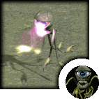
…or is it not?
Some fans hate the Heroes IV graphics, saying they look like plastic toys (unlike paper dolls in previous games, I presume? Bah!). Even if it is a matter of taste, I agree your adventure map might end up like a table full of scattered toys.
In order to avoid that, create several layers: first choose the terrain and place the objects (keeping in mind all the previous tips), then leave the center empty but put trees in corners; now add grass (more near the woods and less around the roads). As for finishing touches, include some animals. Needless to say, it all depends on the scene you want to make; crows would circle above wheat fields or bloody battlegrounds, songbirds would most likely dwell in Elvish forests or tropical islands, etc.
If possible, connect the objects with roads; the scenery looks more natural that way, not to mention that the player will appreciate the increased movement. Roads can cover whole areas, like an additional terrain type, or you could use different terrain types (such as a dirt strip on the grass) to create forest paths.

a farm with a pigsty and stables in my upcoming “Midsummer Nightmare” scenario
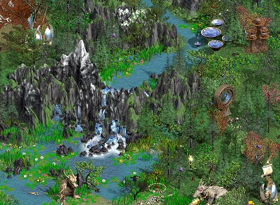
a huge waterfall in “Truth and Justice” by yours truly
The first map that took my breath away was “Sunken Empires” by Aczl. One of the most enjoyable maps I’ve played recently is Dimov’s “Stories for Peasants, Lords and Castles”, which features a wonderful adventure map.
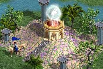
Make the vital spots stand out by using special terrains (which don’t affect spells in Heroes IV) and structures (pillers, hedges, walls etc), like in this screenshot taken from the Equilibris site:
Even multiplayer maps needn’t look bare – take any scenario created by Laelth. In his M masterpiece called “ZMineZ”, the author has managed to include more quests than some have in XL maps!

* The “wow” moments
… as Psychobabble once called unique features in his reviews, are essential.
Sometimes they are just this narrow passage in the dark forest, like in his “My Brother’s Keeper” scenario. Rest assured all those who passed it will never be able to forget the feeling of claustrophobia they experienced!
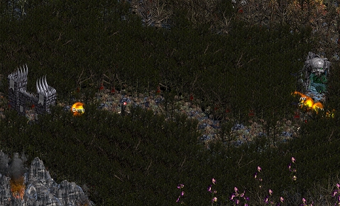
For more exotic sites, play Robenhagen’s “Planewalker” campaigns:

Here he used the elevation tool on the sea (!) to take us to other "planes".

Take a look at his use of snow and water in order to paint clouds! The blurry columns of the hidden bridges disappear in them, creating an illusion of depth.
If these are not your cup of tea, think of original details you might create:

In “AmericanWayHuhuhu” by Vel and Wildbear, you can conquer Iraq and her oil shafts – depicted with gold mines with some cursed grounds and geysers; in addition, you might discover the Iraqi WMD on the left – all you have to do is follow the arrows! :P
These arrows (identical to movement path) are some of the hidden objects, buried deep in the editor. Aside from the pointers, the list includes the Grail, Potion of Immortality, Breeze the Falcon and a few other objects. Several mapmakers like to put a placed event on the artifact pile and give a gift to the hero, for example.

Vel has used the glowing “mire” object to make the Necropolis even spookier
The existing objects can be arranged in new ways; In “Lost Crusade”, Charles Watkins placed Ghosts in dead trees and a Blacksmith in a Quest Hut in order to depict a demolished mansion.
Finally, there are more exotic approaches to mapmaking; special scenarios built around a unique idea or concept can be a lot of fun:
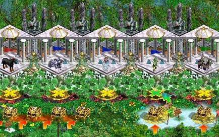
In Vel’s “Poker” you get to play the game, while in his “Draconic” you can bet at the Crocodile Race! :)
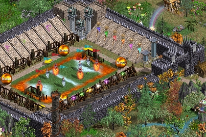
In Ekshenman’s “Town of Sports and Games” you can watch a football match, among other things!
* Mapmaking tricks
Again, this article will focus on aesthetics, rather than other aspects of mapmaking.
I have already mentioned the elevation tool and hidden objects. Some authors excel at creating picture maps, although you must be careful:
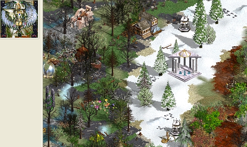
In his masterwork called “Angels Are Back”, Ururam Tururam has sacrificed the adventure map in order to get a dazzling mini-map; he succeeded in covering certain areas with moss, though…

… but I preferred his “Around the Calendar”. Don’t miss his new scenario “Song of the Wraith”, featuring another stunning mini-map!
* Brushes
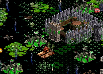
... are another important tool. Forget the pre-done sets – they are good for covering huge areas with grass only. Instead, create your own brushes. You can include events and customize them afterwards, overlap towns or enable heroes to move through the void terrain, best shown in Vel’s “A Beautiful Land”:
* Equilibris
Although its developers emphasize it is a balance mod, the upcoming 3.6 version is going to introduce dozens of new adventure objects, mostly various quest huts, creature corpses and different structures. Don’t miss the next update!

Search for more random tips in my Heroes IV reviews.
Other games exist, too.
Don't be ashamed to look for your inspiration elsewhere. :)
The Heroes IV editor enables you to make reproductions of the sights from Age of Wonders, Disciples, Warcraft, and even classic RPGs such as Baldur's Gate, Diablo or Neverwinter Nights.
Re-create ancient temples or forgotten ruins from your favorite books, movies and comics.
Make a clear reference, though; it is not plagiarism if you admit it - it's an homage. ;)
Heroes V
The release of the latest sequel has been postponed, and the information on the new editor is scarce. The one screenshot proves the existence of mapmaking tools in Heroes V, but nobody aside from developers can tell more than that.
Sadly, it is obvious there will be no interactive landscape (like in Age of Wonders, for example), which was on the wish list of the fans for a long time.
Heroes V will introduce 3D graphics, which might change the way maps are made… or maybe not. We’ll have to wait and see.
This section will be updated once the game is finally published.
By Vladimir Kuzmanov aka Vlaad
